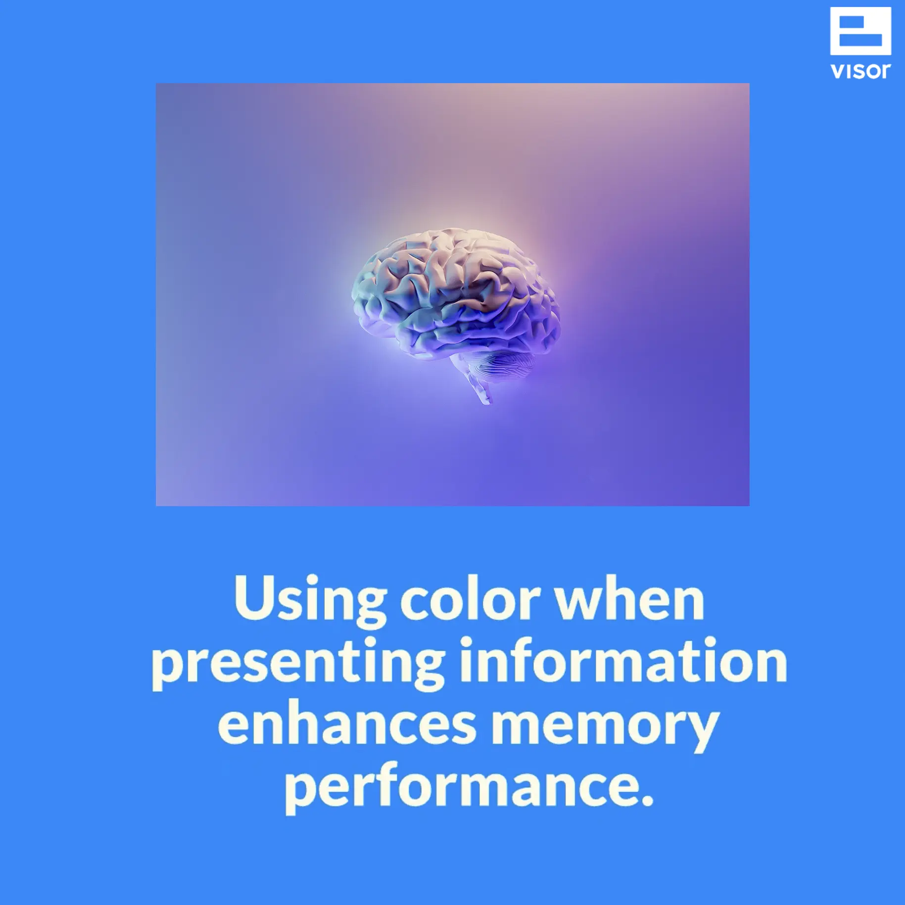
When you think of color, you probably think of a rainbow. Your mind probably doesn’t immediately go to the psychology of color and how to leverage the relationship between colors to make your data work for you.
However, color psychology and color theory are at play all around us, whether we know it or not.
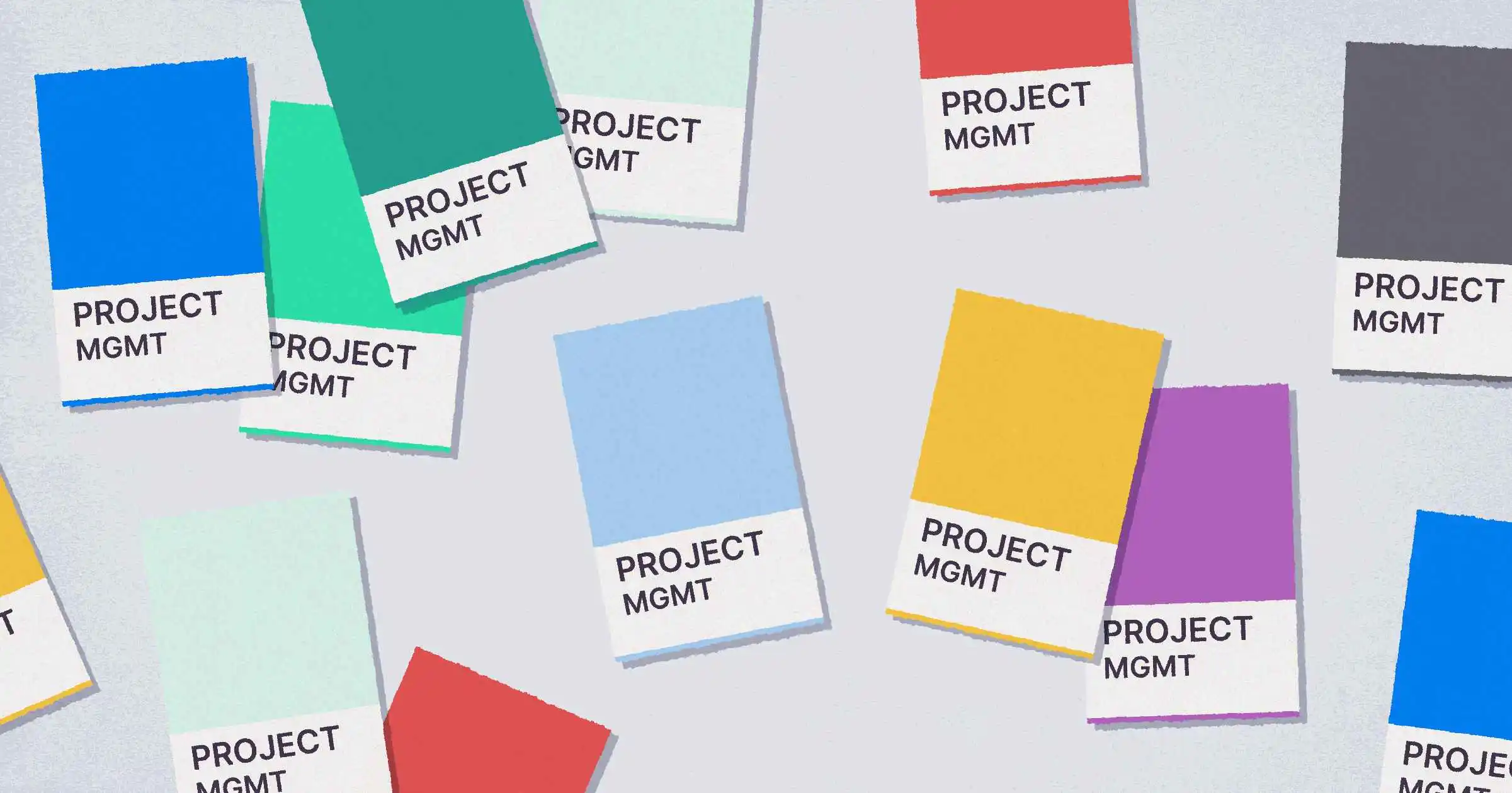
When it comes to project management, data tells your story. Whether you’re communicating resource allocation or updating stakeholders, your data speaks volumes.
So, how can we use color to make this data go even further? Let’s dive deeper.
There is a lot to learn about the psychology of color. Let’s start with its definition: the conscious or subconscious effect of color on perception and reaction.
We know black is the color of mourning and that brides wear white. A red sign usually means danger, and pink is associatedwith softness and naivety. But how can we leverage these perceptions and reactions as project managers?
Primary Colors
Red – As the first primary color, red is known to be a color of danger. It is also frequently associated with passion, desire, and love. As far as subconscious reactions go, as stated above, red enhances human metabolism, increases the rate of respiration, and raises blood pressure. It tends to attract more attention than any other color.
🔴 Best used for: items in your project that need immediate attention.
Yellow – Why do we associate intelligence and mental capacity with the term “bright’? Because of yellow, of course! Yellow is used to talk about good ideas, heightened awareness, and energy; it has even been shown to increase left-brain activity. Careful, though: too much yellow can overstimulate. Babies are even known to cry more in yellow rooms! Brands that use yellow include Snapchat, Ikea, and Post-It.
🟡 Best used for: items that require attention but are not urgent.
Blue – Blue is often associated with being the color of tranquility and peace. It signals sincerity; brands often use blue to signal trust and compassion. Brands known for using blue include institutions that need to foster reliance, such as banks and insurance agencies. Think Chase, Allstate, PayPal, and Blue Cross.
🔵 Best used for: pitch presentations and idle statuses that are not urgent.
Secondary Colors
Orange – Known for being the color of persuasion, orange is also associated with joy, sunshine, and enthusiasm. It can also foster feelings of creativity, determination, and encouragement. Brands you see using orange include Harley Davidson, Fanta, and Hooters.
🟠 Best used for: pitch presentations, timeline pivots, and exciting updates.
Green – Green is frequently associated with nature, freshness, and health. You often see green associated with brands that tout vitality and productivity, like John Deere, Green Giant, or Starbucks. Opposite of red, it has a calming effect.
🟢 Best used for: signaling start dates, items that have yet to be started, to signal forward momentum.
Purple – As a secondary color, purple combines the trust and steadiness of blue with the passion and energy of red. Often associated with royalty, it symbolizes luxury, power, and extravagance. It can also be associated with mystery and spiritualism. Hilariously, brands that use purple include FedEx and Taco Bell. I’ll let you do with that information what you will.
🟣 Best used for: talking about expenses, feature releases, and highlighting authority.
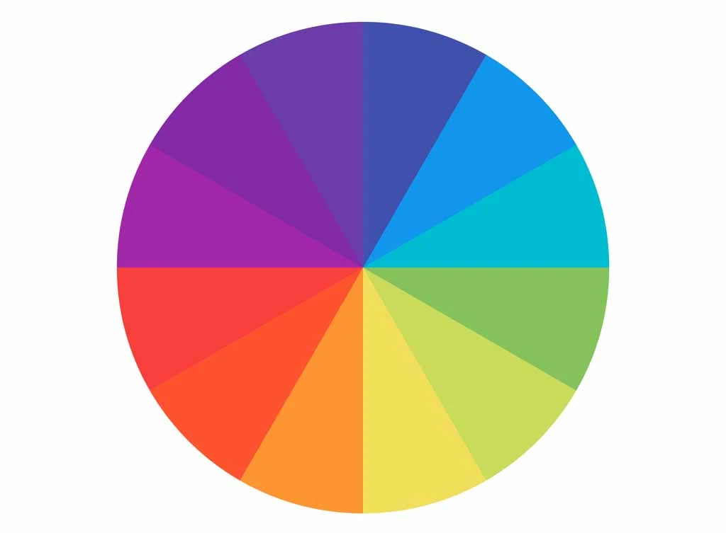
Understanding the location of colors on the color wheel helps us understand what colors go well together — otherwise known as color harmony. If you work as a designer, the relationships between colors, including their various hues and chromas, can be very nuanced. In this article, we will focus on two: analogous and complementary.
Analogous Colors
Analogous colors are three colors that sit next to each other on the color wheel. These are usually one primary or secondary color and their corresponding tertiary colors, with one color being dominant. For example, yellow-green, yellow, and yellow-orange would be analogous colors where solid yellow is the dominant color.
Complementary Colors
Complementary colors are two colors that are opposite each other on the color wheel. These colors create a stark difference that is not too unappealing to the eye. Complementary colors are opposing colors that create maximum contrast and maximum stability.
It is important to know these relationships between colors as you never want your color scheme to be too boring and lose attention, but you also do not want it to be too overwhelming to the eye. The human brain is also drawn to what it can organize and understand. Seeing things with our eyes often requires our brains to process a logical structure.
Using Color for Project Management
Armed with the knowledge of which colors go well together and how to use colors to portray image, emotion, and affect perception, how can we apply this to project management?
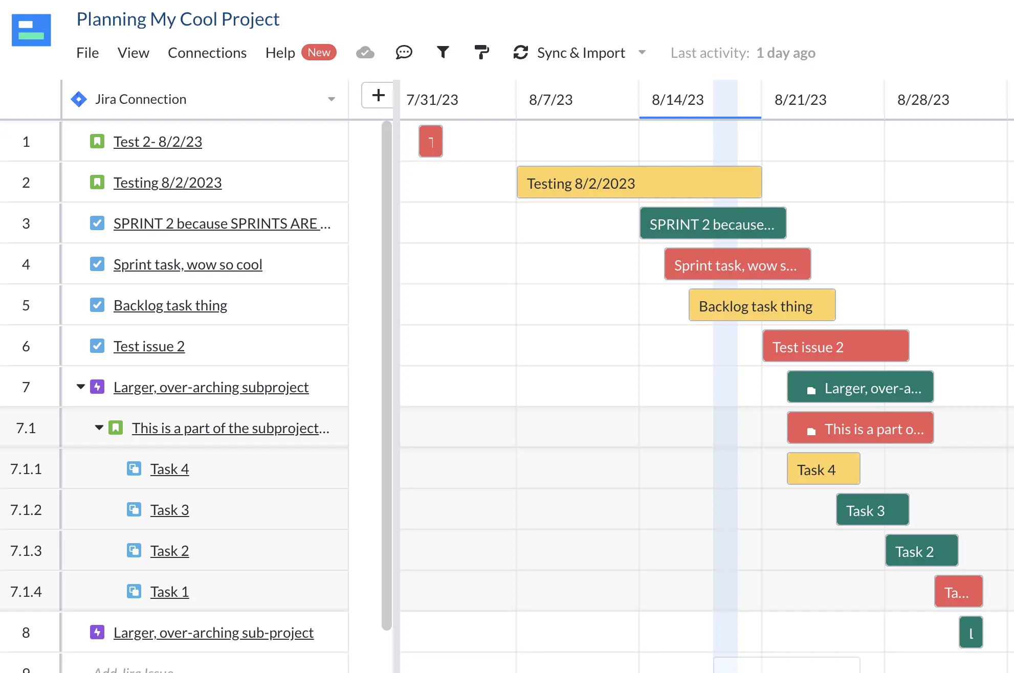
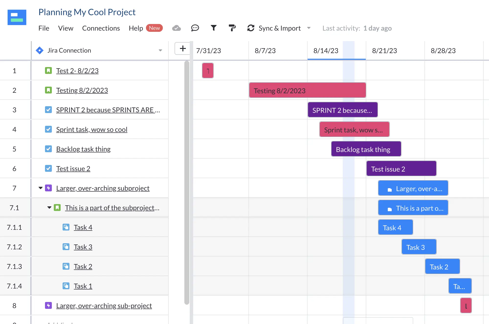
Complementary Colors to Show Status and Progress
The human brain already associates certain colors with instruction and status. Think of a stop light: red means stop, green means go, and yellow means caution. Applying this same schema to statuses such as “To Do” and “In Progress” makes a lot of sense and is a pattern the brain can readily recognize. Formatting statuses like “Blocked” or “Bug” with red allows your team to identify these danger areas and respond accordingly.
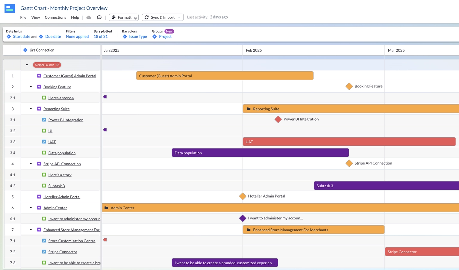
Gantt chart made in Visor using complementary colors:
Analogous Colors to Present Divided Work and New Projects
Using three consecutive colors on the color wheel can add some harmony to your workflows while still diversifying the information you care about. Giving a presentation to the CEO and need to seem trustworthy and powerful? Use a combination of blues and purples to give an aura of regality and sturdiness to your graphs and charts. Trying to get your team excited about a new project? Present it with yellows and oranges to get spirits high and good ideas flowing.
Many project management tools allow you to customize and format your workflows. With Visor, you can customize data you import from apps like Asana and Jira (or you can input data directly into Visor). From there, you can turn your data into a color-coded Gantt chart or other views (like a dashboard).
Check out the video below to see how you can quickly turn your project plans into a colorful chart:
Conclusion: Use Color When Sharing Project Plans
Experienced project managers know the importance of bringing color theory into their project plans before sharing with stakeholders or individual contributors, as part of any strategy to maximize stakeholder engagement.
Whether using color to identify risks or when sharing your portfolio of project plans, you’ll make your data more legible and memorable. AI project management tools, such as Visor, make it even easier to use color theory in the visuals you share.
Below you’ll see the various views Visor allows, all of which offer conditional formatting. Color, when used in this way, brings a visual logic to your plans, making your projects legible and digestible.
A menace to society but a blessing to a Jira board, Rae is an official member of the Atlassian Creators program and a project management thought leader. She is a proud Cal Poly alum, a less proud Scorpio, and an avid wine enthusiast.
This blog showcases the best examples of roadmaps in specific categories, including: In each section, you will also find links to guides to help you create...
There are many tools you can use to manage your projects, but which are the best tools for managing multiple projects? The distinction between managing projects...
To provide the best experiences, we use technologies like cookies to store and/or access device information. Consenting to these technologies will allow us to process data such as browsing behavior or unique IDs on this site. Not consenting or withdrawing consent, may adversely affect certain features and functions.
Functional Always active
The technical storage or access is strictly necessary for the legitimate purpose of enabling the use of a specific service explicitly requested by the subscriber or user, or for the sole purpose of carrying out the transmission of a communication over an electronic communications network.
Preferences
The technical storage or access is necessary for the legitimate purpose of storing preferences that are not requested by the subscriber or user.
Statistics
The technical storage or access that is used exclusively for statistical purposes.The technical storage or access that is used exclusively for anonymous statistical purposes. Without a subpoena, voluntary compliance on the part of your Internet Service Provider, or additional records from a third party, information stored or retrieved for this purpose alone cannot usually be used to identify you.
Marketing
The technical storage or access is required to create user profiles to send advertising, or to track the user on a website or across several websites for similar marketing purposes.
To provide the best experiences, we use technologies like cookies to store and/or access device information. Consenting to these technologies will allow us to process data such as browsing behavior, to improve the performance of this website.
Functional Always active
The technical storage or access is strictly necessary for the legitimate purpose of enabling the use of a specific service explicitly requested by the subscriber or user, or for the sole purpose of carrying out the transmission of a communication over an electronic communications network.
Preferences
The technical storage or access is necessary for the legitimate purpose of storing preferences that are not requested by the subscriber or user.
Statistics
The technical storage or access that is used exclusively for statistical purposes.The technical storage or access that is used exclusively for anonymous statistical purposes. Without a subpoena, voluntary compliance on the part of your Internet Service Provider, or additional records from a third party, information stored or retrieved for this purpose alone cannot usually be used to identify you.
Marketing
The technical storage or access is required to create user profiles to send advertising, or to track the user on a website or across several websites for similar marketing purposes.