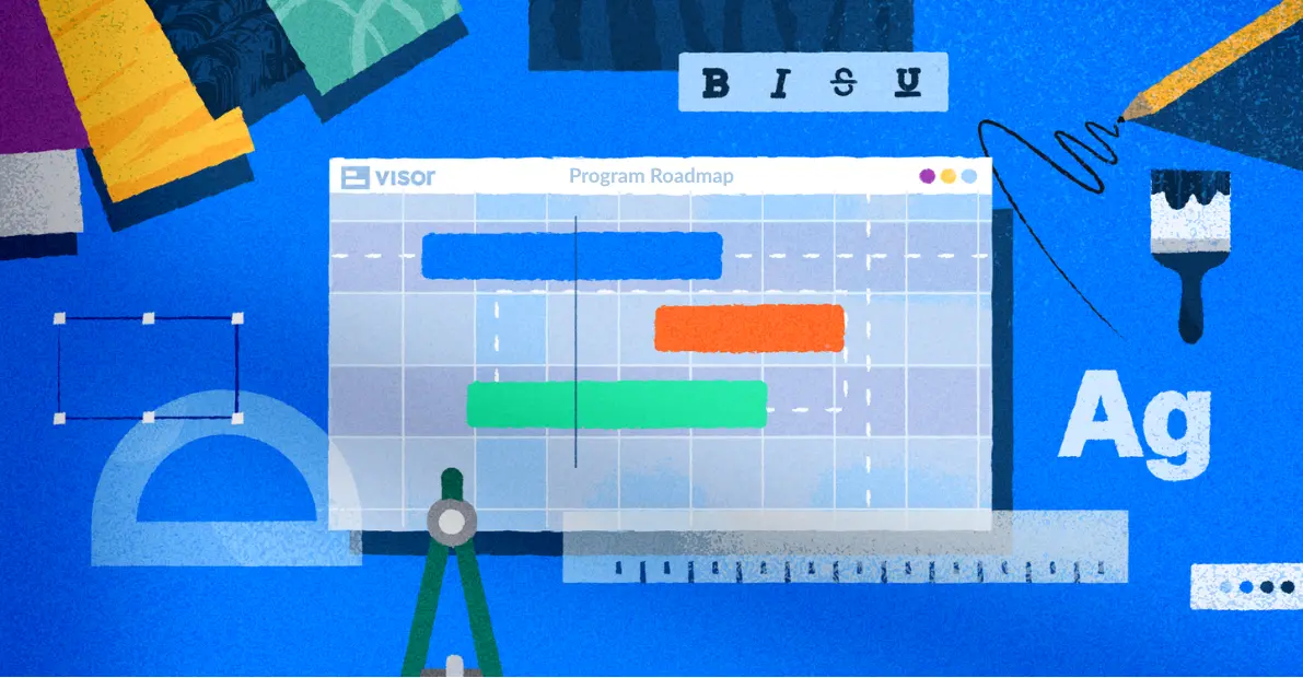
Color Presets & Tips for Color-Coding Gantt Charts


Start using Visor today
- Visualize all your projects and data

- Roll up multiple projects into portfolio views
- Try Visor for FREE
As a project manager, Gantt charts are part of my day-to-day life.
Color-coded Gantt charts are invaluable when tracking and visualizing projects; they aid in visualization and help with project organization.
And you don’t even have to be a whiz at Microsoft Excel to make them.
In this post, I will cover:
- Why color coding your Gantt chart matters
- Tips and presets for choosing the best colors for your Gantt
- Steps for creating Gantts in Visor using data from apps like Jira, Asana, or Excel
Why Color Coding Your Gantt Chart Matters
Color psychology can help you send a real message. 🎨
Some color patterns have been proven to resonate with the brain to deliver certain messages.
The field of color theory unpacks the real-world benefits of understanding color’s impact on the psyche. For example, the human brain associates certain colors with instruction and status.
When it comes to project management, data tells your story. Color can make this data go even further, whether you’re communicating resource allocation or updating stakeholders.
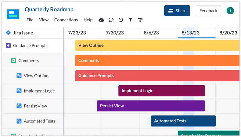
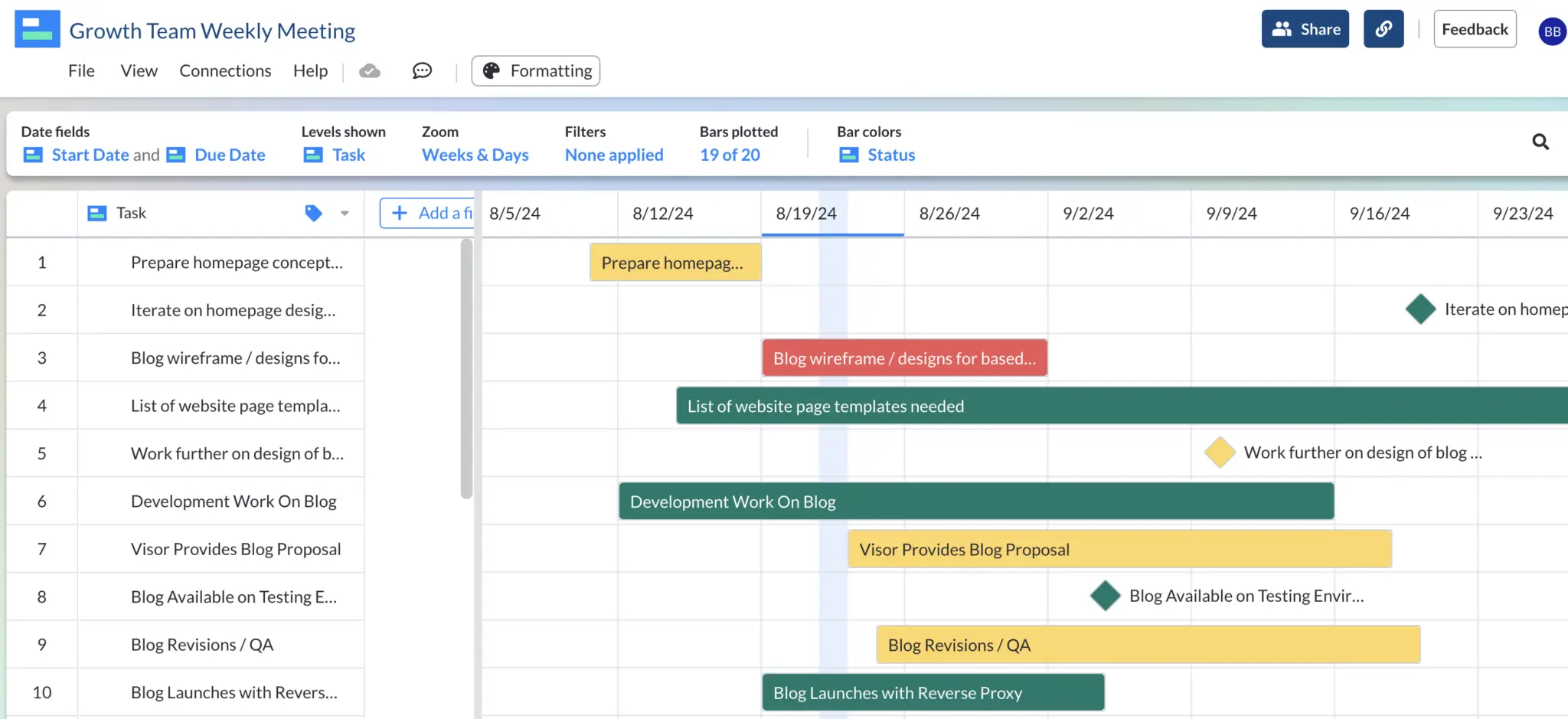
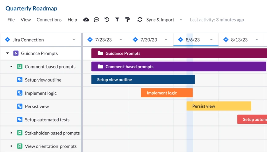
Color-Coded Gantt Chart Created With Visor:
Making your data pop can hold people’s attention.
Information overload is a real thing. Presenting your data in a way that stands out can be the difference between a riveting presentation and one that puts people to sleep.
We’re not saying you need to color everything highlighter yellow to make it interesting, but adding some dimension to your presentation using color can be incredibly helpful in holding attention and making key things stay focused.

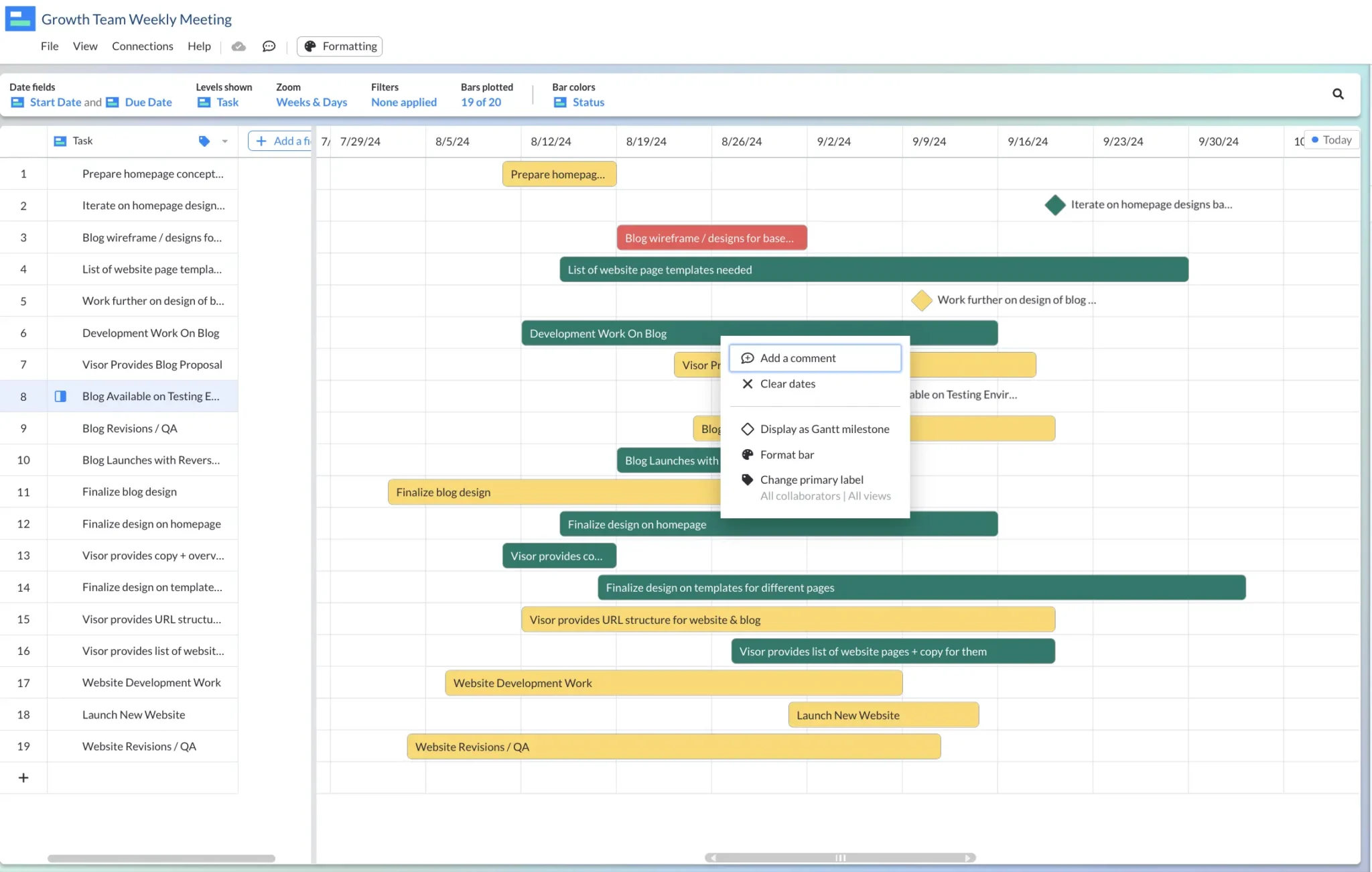
Conditional Formatting to Color Code Your Gantt
Color coding your Gantt chart makes it easy for you and your stakeholders to understand a project’s progress just by glancing at it. But what if you want to make sure the colors of your Gantt chart always remain accurate? That’s where conditional formatting comes in.
Tools like Excel and Visor’s Gantt Chart Maker offer conditional formatting so you can set colors based on certain criteria (e.g., a status marked as “Done” automatically gets formatted with green).
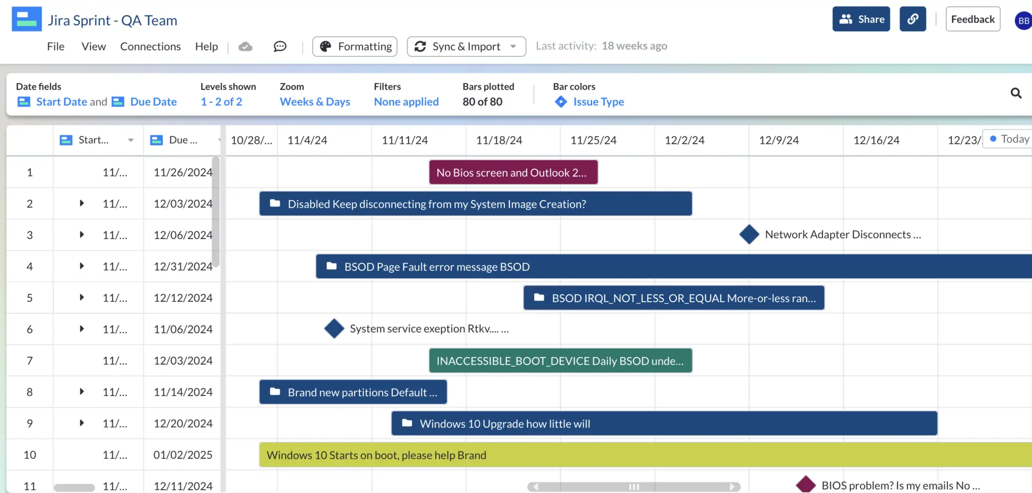
Gantt Chart Created & Formatted in Visor:
Conditional formatting can be set up to do things like:
- Showcase what employee or team is working on a task
- Visually highlight what tasks are blocked, in motion, or done
- Demonstrate which initiatives are tied to which OKRs or goals
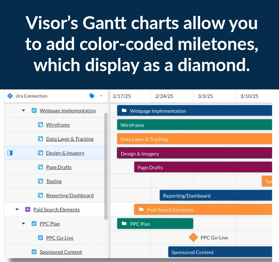
On top of color coding your Gantt chart’s bars, you can add milestones to Gantt charts, making it easier for key dates in your project plans to stand out.
If you’re not an expert at Excel, don’t worry. We’ll show you an easier way to apply conditional formatting to your Gantt chart (even if your data is in Excel) using Visor. Check out the step-by-step process below.
Color-Coded Gantt Chart with Milestones, Created With Visor:
The Easy Way to Make Color-Coded Gantt Charts
There are many different tools that allow you to color code your Gantt chart and project progress views. One of the most popular is Excel. However, Excel has a bit of a learning curve.
As an alternative, I’ll show you how to make a color-coded Gantt in Visor you’ll be proud to share using data you have in Excel or Google Sheets. Visor’s drag-and-drop interface also connects to your SaaS apps like Jira and Asana. In addition, you can add your own data right into Visor.
Steps to Make a Color-Coded Gantt in Visor with Color Presets 🎨
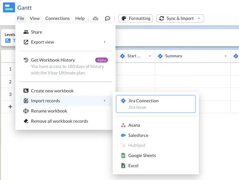
1. Copy and paste your data from Excel into Visor. Alternatively, you can import project plans from apps like Asana and Jira or manually input data right into Visor.
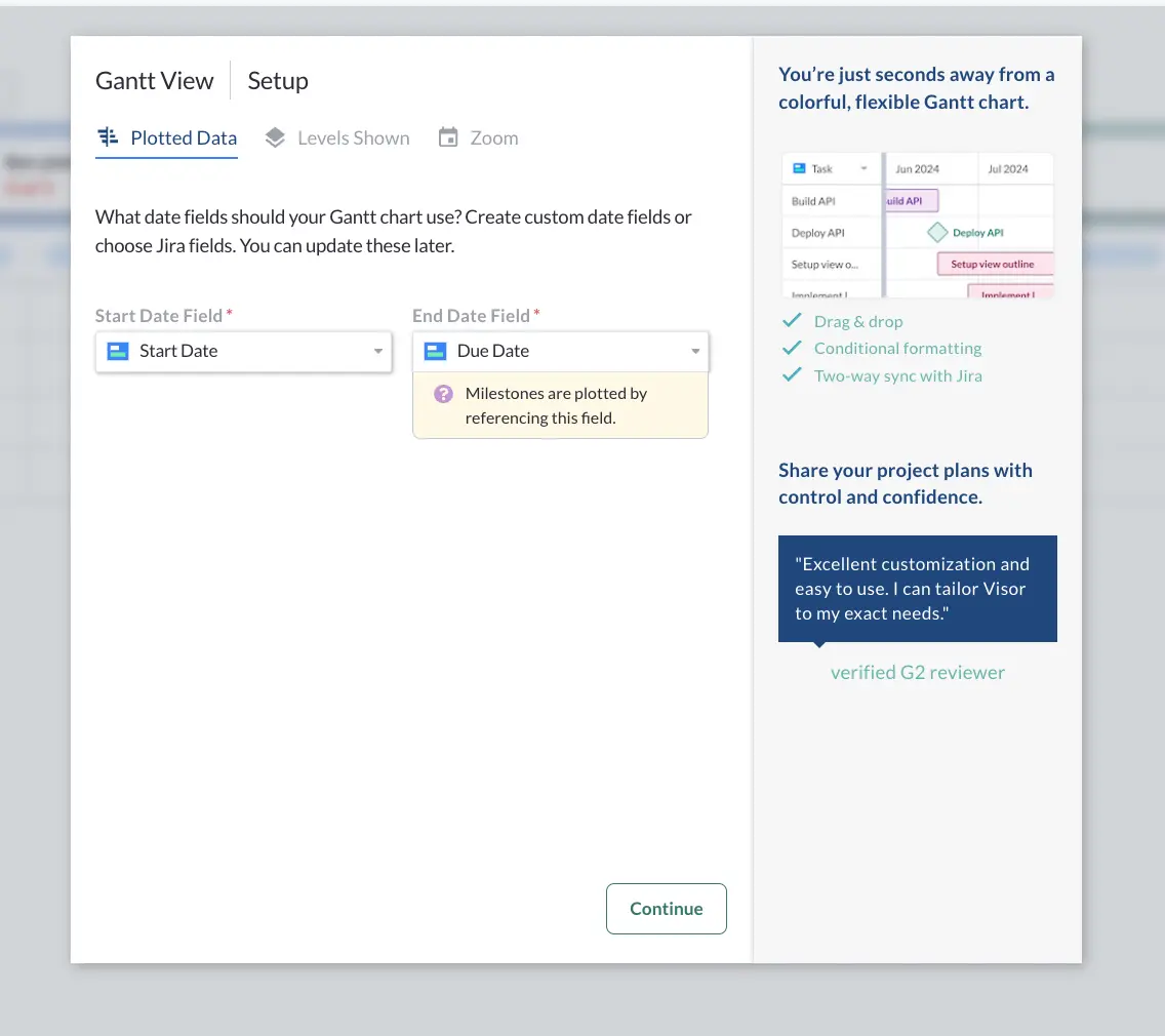
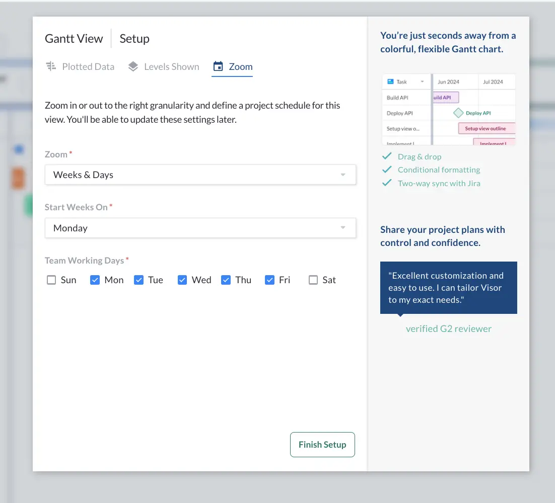
2. Once your data has been imported, simply click the “Gantt View” tab at the bottom of your workbook. From there, you’ll plot your data. You’ll need Start Date and Due Date fields for your Gantt chart.
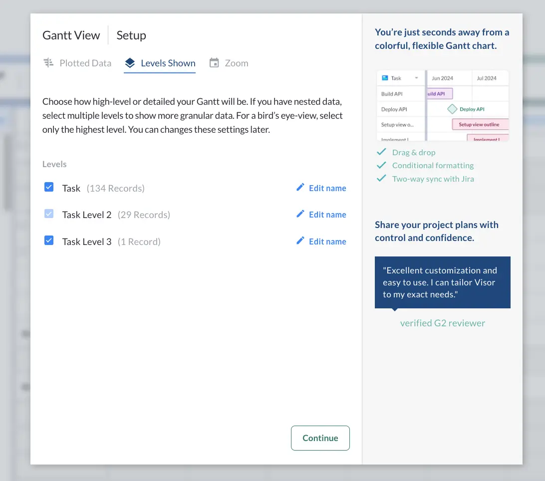
3. Next, you’ll need to decide the level of granularity for your Gantt. Visor allows you to include nested records (or hierarchies). If you only have one level of data, you’ll simply move on to the next step.
4. Next, decide if you want your Gantt to display as weeks & days, months, sprints, or other options available to you.
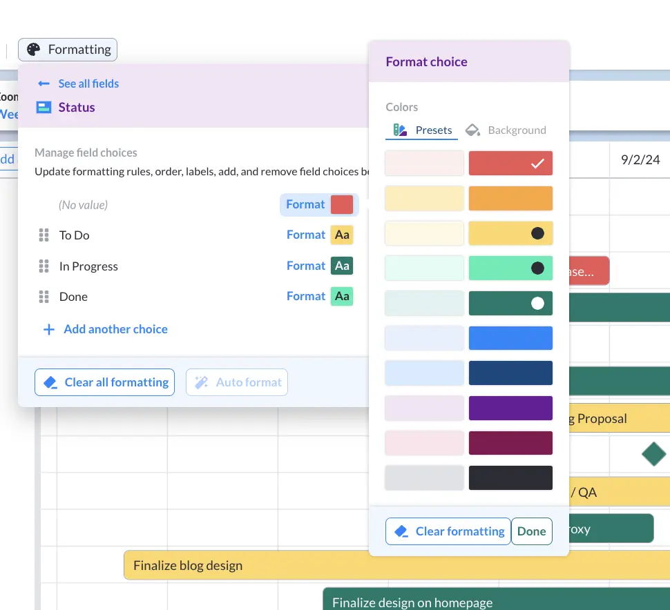
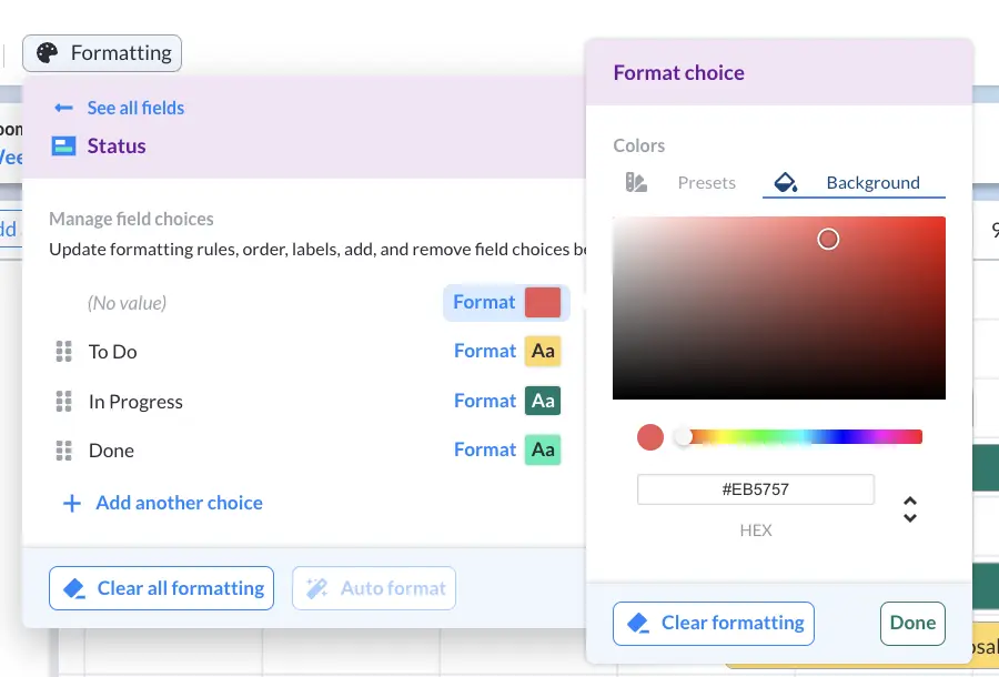
5. Once your Gantt chart is plotted, click “Formatting” to select what field you want color coded. Here, the bars display the “Status” field.
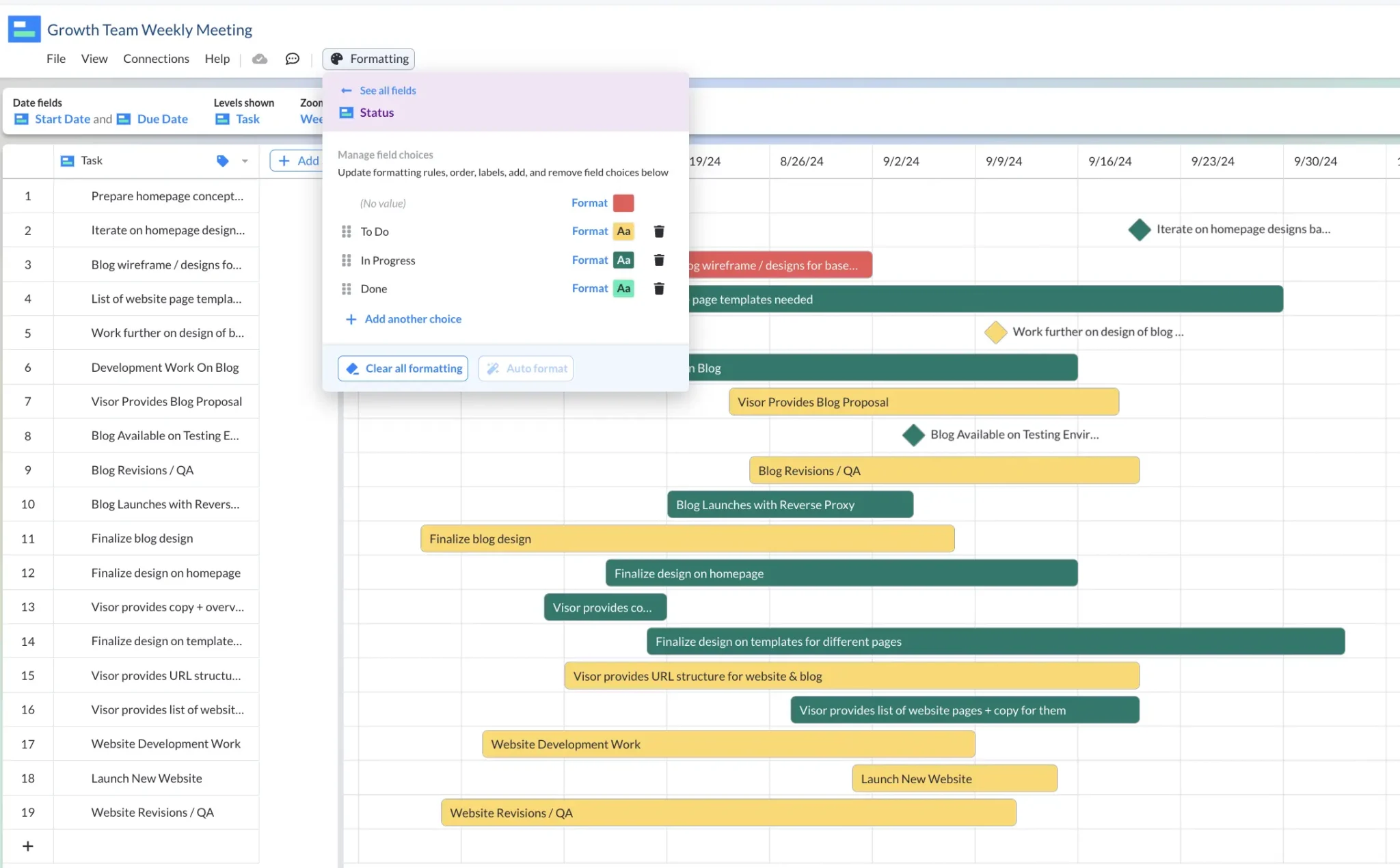
6. You can choose to use Visor’s color presets or add RGB colors that are exactly to your liking.
7. Once your Gantt chart’s bars have color, click on a bar if you want to make it a milestone. Milestones convey that this is an important date.
8. You can move your Gantt chart’s bars around with Visor’s drag-and-drop interface. This allows you to adjust the timing of your project plans.
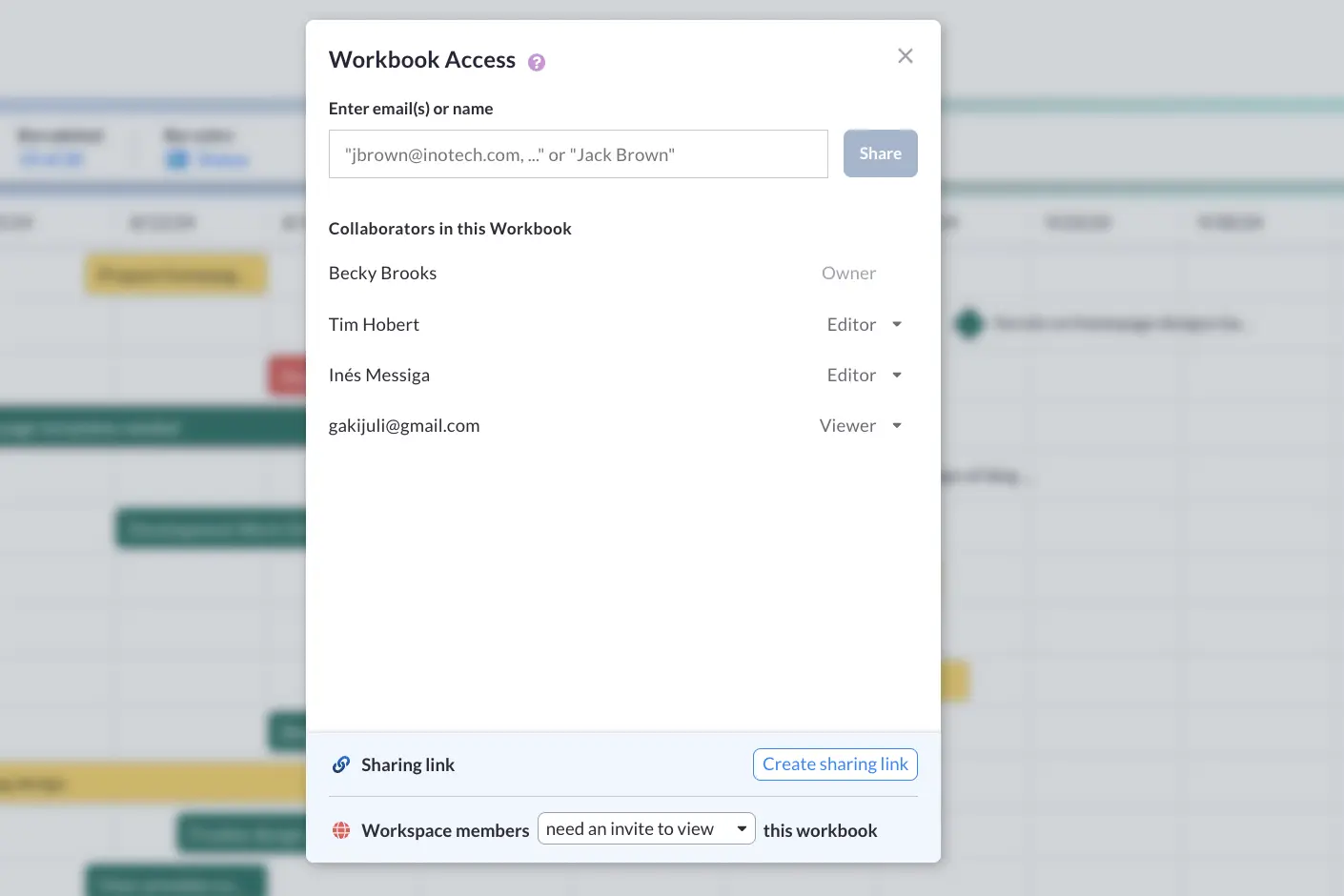
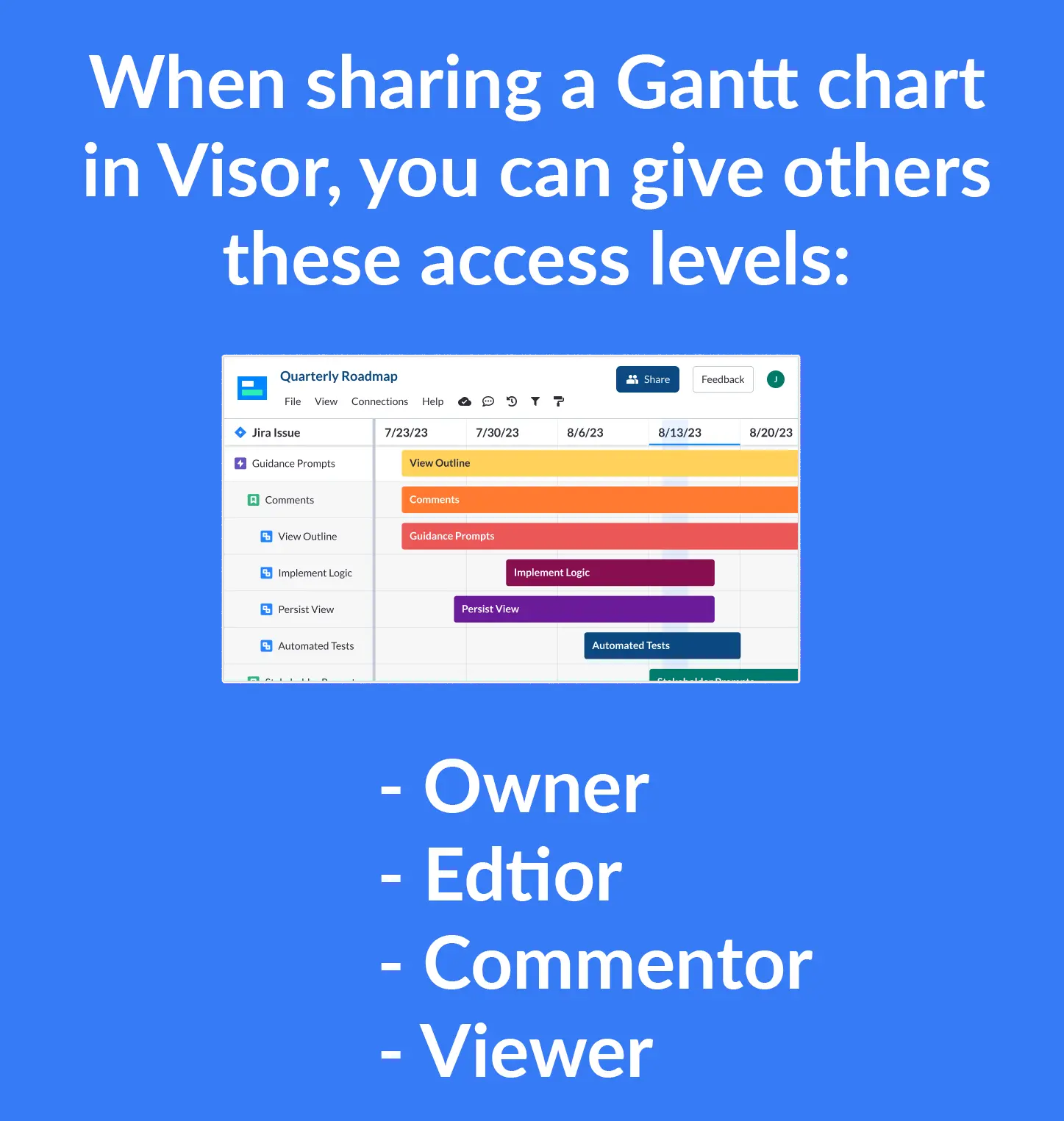
9. When your Gantt chart is done, you can share with whoever you please!
And just like that, you’ve taken your Excel or Jira data and turned it into a colorful, editable, shareable Gantt chart. If you need extra help getting your data into Visor, these videos will help you.
💡 Visor allows you to give different users different access levels.
Video Tutorial: The Easy Way to Make a Color-Coded Gantt Chart
If you prefer video instructions, we took all the steps above and created a short, 1-minute video for you. If you need to make an Agile Gantt chart or use Gantt charts in Confluence, we have a lot of guides and tutorials for you on our blog.
Bonus Tutorial: Create a Jira or Asana Gantt Chart
Visor is an official Atlassian Marketplace Partner and an Asana App Partner, which means we offer two-way syncing with Jira and Asana; this allows you to keep your Gantt chart in sync with your project management apps. Making an Asana Gantt chart or a Gantt with Jira data has never been easier.
Plus, you can take the guesswork out of project planning with project Gantt chart templates (which are powered by AI) and our release roadmap templates that use our Gantt view. Easily build your Visor workbook and transform data in seconds.
You can even add or import multiple projects from Jira, Asana, or Salesforce into Visor, to easily create portfolio Gantt chart views that give you a high-level perspective across multiple projects so that you can see the big picture.
In the video below, you can discover how to make a Jira Gantt chart in 5 easy steps.
Choosing the Best Colors for Your Gantt Chart
Deciding which colors to choose for your Gantt chart can be difficult. However, we have some suggestions below. In addition, there are various systems that you can adopt. A lively discussion at Project Management Institute about color coding projects unpacked some popular systems that PMs swear by:
To colour code projects, we use RAG: Red, Amber, Green. We also use Blue for closed projects. It is a system with a number of limitations because project managers generally try to record everything as green. I have heard of others using ROYG: Red, Orange, Yellow, Green (and I’m keen to understand the difference between orange and yellow).
– Elizabeth Harrin, Director at RebelsGuideToPM.com
In addition to these systems (and depending on the type of presentation, or your goals), there are a few other ways you can format your Gantt chart. Here are a few:
Your Brand Colors
Coloring your Gantt with your brand colors is an excellent choice if you are presenting information to customers or a concept project that isn’t running on hard deadlines or statuses. You can highlight information while getting some good brand awareness in the process!
Color by Project Status
Like a stop light, red usually means stop or danger, green means go, and yellow means caution. Applying this same schema to statuses such as “To Do” and “In Progress” can help send a visual message that viewers can quickly decode at a glance.
Choose an Attractive Color Scheme
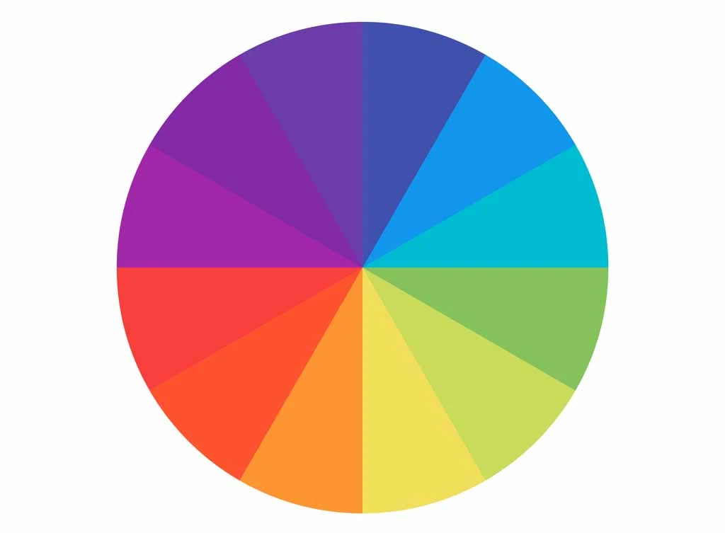
A good rule of thumb when choosing colors that look good together is to go for analogous colors or three colors that sit next to each other on the color wheel. You could also do different shades of the same color, like blue, teal, and cerulean.
Keep Color Simple
Consider using color presets Visor offers to keep your Gantt charts simple. You want to aim for simplicity so that your audience doesn’t get visual overload when first glancing at your chart. Also, simplicity means you spend less time making your Gantt.
Color-Coded Gantt Chart Created With Visor:
Conclusion: You Don’t Have to Be an Excel Whiz to Make Color-Coded Gantt Charts
Drag-and-drop tools like Visor make it easy to create colorful project plans that people will stick in people’s memory. Adding color to your Gantt charts helps boost comprehension. Also, it makes you look polished and professional at work.
And the best part? You don’t have to be an expert at Excel to create colorful charts that help you visualize your project data. Instead, use Visor’s Gantt view for free to share sleek charts you’ll be proud to share.