
The Difference of User-Centered Design

Start using Visor today
- Visualize all your projects and data

- Roll up multiple projects into portfolio views
- Try Visor for FREE
Design isn’t just an aesthetic layer—it’s the difference between success and frustration for users.
That’s especially true for Visor. As a flexible, integration-first tool for project portfolio management, Visor has to work for a wide range of use cases. Project managers rely on it to track progress, create reports, and align stakeholders—but that’s not easy when every team works differently. Visor is built to integrate with a variety of different platforms, from Asana to Jira to HubSpot—but with such a wide range of data input styles, designing a cohesive output is a challenge.
We knew early on that creating a clear, beautiful, consistent design for that kind of flexibility would be difficult. A product that’s too rigid won’t work for everyone, but too much flexibility can overwhelm users. Striking the right balance between ease of use and power is what makes great design so hard—and so essential. On one side lies the need to support a myriad of use cases, from highly technical users demanding advanced functionality to those who are newer to digital tools and require a guided, straightforward experience.
As Visor’s Principal Product Designer, my job is to make sure our product not only looks great but also addresses user needs. Here’s a look at how we’re approaching this work.
The Design Challenge: Balancing Flexibility and Simplicity
When teams with varied workflows collaborate in one workspace, the stakes are high. A detailed interface might serve one segment well, but leave another struggling with complexity. Conversely, a design that overemphasizes flexibility risks overwhelming users with too many choices and cluttered information.
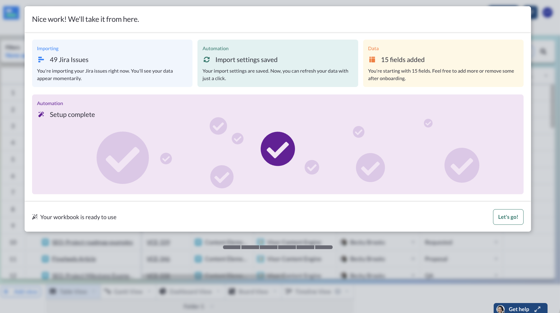
The success screen for our new AI Smart Templates
We often see industry competitors offering copious and complex feature sets, which often serve to “check the box” and help increase pricing plans – while contributing little to actually drive user value. We strive to be different by leaning into a more intuitive, simplified design approach. We still have all the features you need from a project portfolio management software, but with a focus on clarity and ease of use. Everything is where you’d naturally expect it to be, no complicated workarounds required.
We needed a design that is adaptable yet coherent for every user. This challenge isn’t unique to Visor; it’s endemic in any platform that aggregates complex, multi-source data. The challenge is to deliver a product that is both powerful and accessible, a challenge we embrace as the cornerstone of our design philosophy.
To solve this challenge, we looked to our users.
How User Insights inform Our Design Process
Great design is never the result of a single “aha” moment. It’s the product of an iterative process that blends art with science, informed by real user data and insights. Here’s a look at how user insights inform the design process.
Eliminating Assumptions
A central tenet of our approach is to challenge assumptions. You can never assume what users are going to understand.
This means that instead of relying on what we think users might do, we incorporate user behavior and direct feedback into the product & design decision-making process. Our goal is to ensure that our designs truly resonate with the people who use Visor every day.
Qualitative Insights
We use qualitative research extensively. We often observe real user sessions with our customers to help us better understand how they use our product.
Listening to users’ accounts of their experience is also super beneficial. Whether it’s through direct user interviews or internal design feedback sessions with our own team, these insights help us understand the nuances of user behavior.
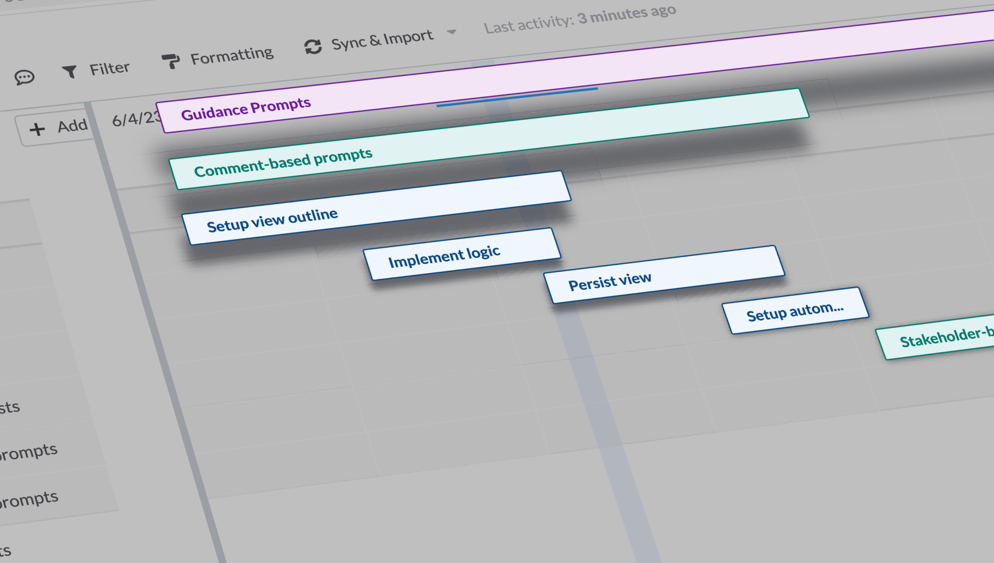
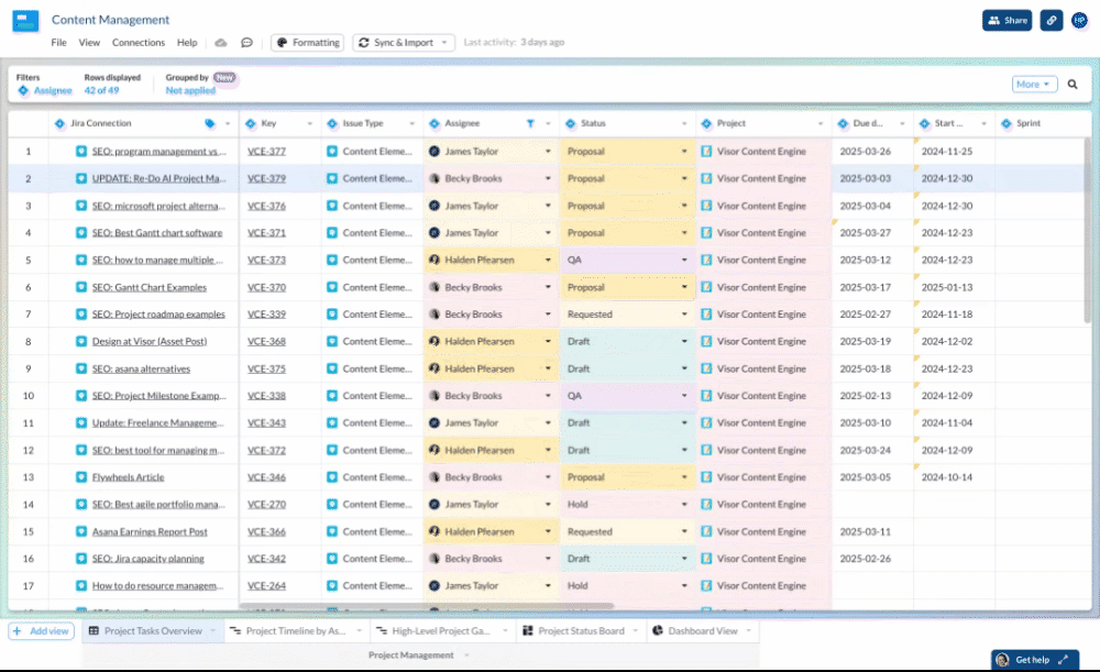
Progress on Visor’s new grid group-by feature
For example, when a user struggles to navigate a new feature, it’s not enough to simply fix the button placement. We dive deeper to understand the context of their frustration. Is it due to unfamiliar terminology? Maybe unexpected workflows, or simply the overload of options? (Another reason we strive for simplicity.) By questioning our assumptions, we zero in on what users actually need. This qualitative data forms the backbone of our design process.
Quantitative Analysis
Complementing our qualitative work is a robust quantitative analysis. We track metrics such as click rates, engagement levels, and workflow paths to see how design changes impact user behavior. These numbers don’t just validate our decisions, they often reveal hidden opportunities for improvement.
There are a lot of factors that influence how product design decisions are ultimately made, and by combining qualitative and quantitative insights, we can address those factors head-on.
All of these insights come together to create a balanced roadmap. At a tactical level, we focus on incremental improvements like unifying components, increasing performance, and implementing small tweaks that enhance the overall user experience. More strategically, we prioritize more ambitious, transformative features that push the boundaries of what Visor can help our users do. This approach ensures that every update, whether it’s a minor adjustment or a major feature rollout, is grounded in the reality of our users’ needs.
Our journey is not just about identifying challenges—it’s about evolving our solutions through constant testing, user feedback, and data-driven adjustments.
Our Design In Action
One of the most exciting examples of how we’ve tackled our design challenges head-on is how we’ve brought in AI-powered templates. This is a perfect example of how we’re marrying user insights with simple, powerful visual experiences.
We’ve seen through user feedback that people want to set up workbooks with minimal effort, in as little time as possible. As a result, we’ve introduced new AI templates.
Case Study: Seamless AI Integration
It was always important to us that our AI is woven seamlessly into the user workflow instead of being treated as a flashy add-on. And while the tech behind the scenes is the engine that makes AI function, designing outputs that were visually compelling was critical to making these templates genuinely useful for the end user.
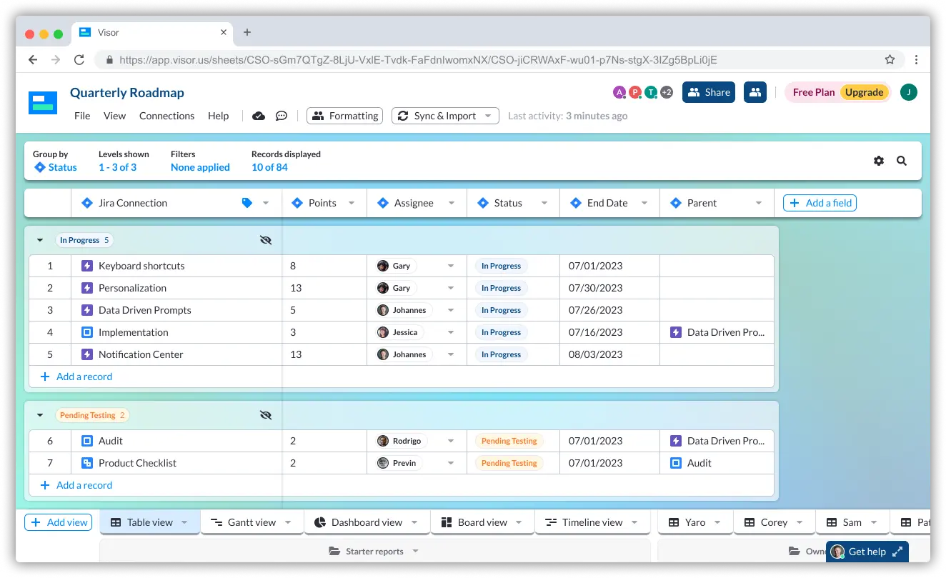
Exploring an AI smart template in Visor
For instance, imagine a project manager juggling multiple data sources from Jira, Salesforce, and other platforms. Manually aligning and presenting that data can be both time-consuming and error-prone. Our AI templates automatically format and optimize the data, allowing the user to focus on strategic insights rather than tedious formatting.
AI can offer a granular look at data for a technical project manager in one view, while delivering a clear, high-level summary for an executive. This flexibility is essential in a product like Visor, where the audience spans a wide spectrum of technical proficiency.
By harnessing AI, we bridge that flexibility-simplicity gap. It’s a solution that not only meets a need but also reinforces a big part of our overall design philosophy: making the product crystal clear for every user, regardless of their background.
Functional, Delightful Design
After lots of data and a handful of variations, the interface we settled on combines simplicity and flexability. And that interface deserved a look and feel all its own.
Behind every great tool is a visual language that not only guides but delights. At Visor, our design is rooted in a consistent visual identity that enhances usability and reinforces our brand’s promise of clarity – we call it Crystalmorphism.
Building a Consistent Experience
Inspired by the look and feel of crystals, crystalmorphism is a design style that evokes both transparency and structure. Crystalmorphism isn’t just about making things look “crystal clear”; it’s about creating an interface where every element is intentional and serves a purpose as part of the overall structure. We have a transparency on our tables that unifies data and makes your information stand out clearly. Our different views – Gantt, Kanban, dashboard, etc. – prioritize collaborative work to create team alignments. Even our loading screens use crystalline patterns for visual appeal that communicates movement. This consistent aesthetic ensures that whether you’re looking at a detailed report or a high-level dashboard, the experience is cohesive and intuitive.
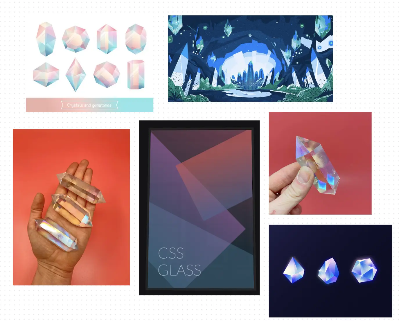
Some of the inspiration board for Crystalmorphism
Every pixel, every color choice, and every layout decision is made with the goal of reducing cognitive load. When users navigate around Visor, they shouldn’t have to decipher a cluttered interface or hunt for the right information. Instead, the design acts as a silent guide, leading them effortlessly through complex data landscapes.
Enhancing Usability Through Design
A unified visual identity is not only about beauty, it’s about function. Our design choices are always measured against their ability to simplify the user experience. For example, our dashboards are designed to crystalize granular data into easily digestible summaries. Rich text blocks, clear visual metrics, colorful formatting, and intuitive navigation all contribute to a system that feels both powerful and accessible.
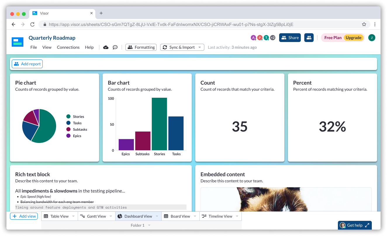
Visor’s dashboard design in progress
In one team discussion, I noticed that even subtle shifts in color contrast or typography could dramatically affect how users interpreted data. This attention to detail ensures that the interface is not only visually appealing but also perfectly aligned with the needs of its users.
Ultimately, our visual identity supports the larger narrative of Visor: something that makes even the toughest challenges crystal clear.
It’s a design language that tells a story: one of innovation, precision, and an unwavering commitment to user success. This unified approach is at the heart of everything we do, reinforcing the idea that great design is the secret weapon that turns frustration into success.
Looking ahead
Our challenge was always about striking a balance, ensuring that the complexity of diverse workflows didn’t overwhelm users while preserving the depth of functionality they need. Visor meets this challenge by blending rigorous user insights with innovative design; our AI-powered templates and unified, crystal-inspired visual language transform intricate data into clear, actionable insights.
This approach not only simplifies the user experience but also empowers every user, from technical experts to newcomers, to navigate their projects with confidence and clarity.
The journey of innovation never ends, and we have to evolve if we want to keep up. As our user base grows and their needs become more complex, we have to consistently recommit to intuitive, adaptive design.
But innovation is embedded in our DNA. We’re continually experimenting with new ways to harness data, streamline workflows, and create experiences that resonate with our users. The rollout of AI templates is just one example of how we’re pushing the envelope.
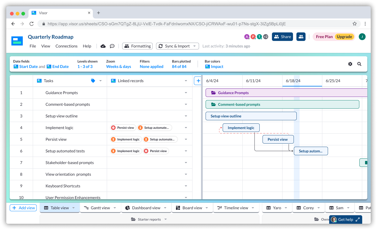
A sneak peek at some of what’s up next for Visor!
Something I really appreciate about this role is working within our iterative process: every design tweak, and every new feature, is an opportunity to learn, adapt, and improve. This continuous cycle of feedback and refinement ensures that Visor remains at the forefront of user-centric design.
Great design isn’t about adding more features; it’s about making every feature count and eventually creating an ecosystem where complex data is always digestible.
That vision starts with the users, and we can’t lose that focus – even for a moment. I invite you to explore Visor to see for yourself how simplicity and flexibility can combine to make every project crystal clear.